Design day hackathon: Creating a cutting-edge website for a consumer health brand
by Graphite Digital 15 March 24In their most recent quarterly meet-up, our design and research teams created a new website for a fictional consumer health brand in just 3 hours.
Learn more about how they navigated the design challenge, fostered teamwork, and applied creative solutions.

The challenge
The challenge involved designing a brand new website for a fictional continuous glucose monitoring device (CGM) company. The brand, which we called OSE, wanted to break through in the growing market of CGM for health-conscious individuals.
The teams received a comprehensive brief that was focused on optimising performance, converting new customers, and attracting investment. They were also supplied with basic brand guidelines and key customer personas to align the new design and user journeys to.
Once the new design was complete, the teams needed to undertake usability testing and seek feedback to validate the experience for users — making sure the final product not only looked good, but offered an intuitive, engaging experience for customers.
Our approach
We split into two teams with a blend of UX, UI, and Product Designers. Our approach for the day represented an accelerated version of an approach we'd take with our real clients. This 4-step process is all about blending ideas with practical needs, making sure what we design really works for OSE and their audience.
- Assess: Understanding the brief and the needs of the client
This phase is about getting to know the ins and outs of the brand, their values, objectives, and the hurdles they're facing. We wanted to understand their audience - who they are, what they like, and what they dislike, and made sure not to ignore the competition so we could see where we could stand out or do things better. Define: Outlining the scope and key deliverables.
Through defining, we get clear on what we need to deliver so we can set the goals for the website, source all the branding like logos and colours and prepare a guide for testing our designs on real people.Create: Bringing the vision to life through design.
In the create phase, we started by sketching out the website's layout with simple wireframes, focusing on usability before design. From there, we moved to more detailed designs, incorporating OSE’s branding and assessing and tweaking elements until we have slick prototypes, ready to test out.Test: Validating the usability and impact of our designs.
The test phase ensures our designs ticked all the boxes by running tests with users, evaluating how they got on and listening to their feedback. This helped us tweak and polish our designs until we were sure they were looking great and working well.
Outcomes
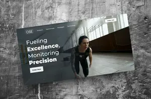
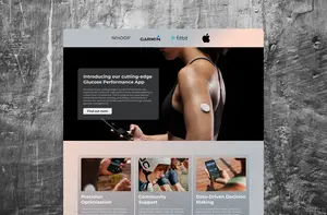
Team 1
Team 1 decided to focus primarily on the journey that would get potential customers to sign up and subscribe. Their top considerations were to optimise search functionality, embed content and create engaging customer journeys that facilitated conversions.
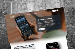
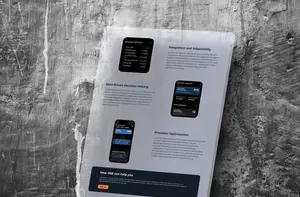
Team 2
Team 2 looked at the challenge from another angle, going for a highly visual approach, whilst keeping client needs front of mind. The logo and branding were strongly incorporated throughout the website. The product page was designed to inspire users to take action, with coherent user journeys.
Using ChatGPT to populate content
We’re often asked to design websites, apps, and platforms, and a common theme we’ve come across is that the client hasn’t yet thought about the content. The mismatch between design and content can lead to challenges later down the line when trying to write content that doesn’t fit the design structure, resulting in the need for additional design/development work.
With this task, we turned to ChatGPT to generate realistic placeholder content, helping to make the prototype feel real and giving content writers a starting point for copy structure, format and length - an approach we could use with real clients in the future.
User testing
The teams worked with our Clinical UX researcher to build a usability testing discussion guide, which facilitated an in-depth evaluation of our designs and allowed us to view our work through the lens of the user and refine our approach accordingly. The digital products were analysed and scored based on factors like the quality of the branding, visual finesse and content, before final improvements were implemented to the designs.
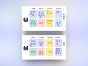
Living our values and enjoying full creative freedom
At Graphite, our values are centred around collaboration and continuous improvement. Our Hackathon day was the perfect chance to put these values into practice, working collaboratively to solve a real-life digital challenge within the world of consumer health.
Thanks to our Head of Design, Ed Hart, for organising the day, and to the rest of our designers and researchers for taking part.
