- User Interviews
- UX and UI Design
- Usability Testing
Online Doctor: Optimising the telehealth experience within the Vhi app

Outcomes
- Service usage increased by 407% in 3 months
- Apple App Store rating of 4.7 achieved
- 4 x amount of successfully completed appointments in 3 months
How we created value:
We partnered with Vhi to relaunch the Online Doctor telehealth service within their core customer-facing app. Working to quickly respond to changing consumer demands and priorities, we undertook user testing, wireframing and concept testing to deepen understanding of customer needs, then implemented our learnings through UX & UI design to create an optimised digital experience.
The new and improved Online Doctor service drove a rapid increase in users by providing quick and easy access to medical information from the comfort of their homes. Through the addition of a streamlined booking and consultation process, helpful notifications, simplified access to key information, and defining clear expectations of service features, Vhi were able to step up for their members and elevate this vital service.
Setting out to create a more consistent and efficient customer journey
A major focus of our work on this project was to bring the Online Doctor feature into Vhi’s core app. Previously, it had directed users to a third-party platform to progress the appointment, creating a clunky and inconsistent user journey.
The booking process also needed addressing. The old ‘virtual queue’ process had worked well pre-pandemic when demand for telehealth services was relatively low, but was now struggling under the significantly increased usage. By improving the booking process and introducing set appointment times, we’d be able to create a much more efficient and positive experience.
Identifying the key challenges and priorities for Vhi members with user research and testing
We conducted user testing with Vhi customers to understand particular pain points in the user journey and their needs and expectations when accessing Online Doctor. The challenges identified included;
- Finding relevant information: Users were struggling to find information about what to expect from the consultation and felt this was missing from the booking process. We needed to resolve this and ensure all relevant information was easily available in the app.
- Booking appointments for dependents: There was confusion around how to book appointments for dependents and the different steps required, leading to incorrect bookings for unwell children that were causing frustration and worry for parents.
- Flexible information editing: It was difficult to go back and correct errors in the booking, meaning time was being wasted through repeating the entire process. We needed to design a solution that would allow patients to edit their details with ease for a frictionless customer experience.
- Setting expectations: Vhi customers needed the app to better communicate what they should expect once they had booked an appointment. A confirmation of their appointment booking and information around the next steps were would improve the customer journey and reduce confusion.
Implementing learnings through UX and UI design
Balancing business and customer priorities, we took a phased approach to design, delivering the most important changes first and pushing these live, before starting work on the next area. Ideas and learnings from the wireframes, user feedback and client requests were all incorporated.
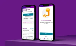
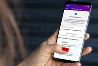
The booking journey: the new booking system was split into logical steps with clear explanation screens. It would Vhi customers to log into the app, choose a time that worked for them and book their appointment — without pushing them out to a third party platform, or requiring them to join a long virtual queue.
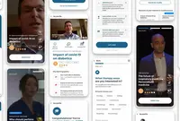
The consultation: the consultation experience was also moved in-app, and a waiting room feature was designed which held users pre-appointment until their GP was ready. Whilst there, users were informed of any updates (such as if their GP was running late) to offer transparency and manage expectations.
Summary screen: a newly designed summary screen was created to appear after the user had finished a consultation. This would clearly shows any next steps for the patients, such as viewing consultation notes or accessing prescriptions from their GP.
Patient listing and appointment history: These features would allow Vhi app users to easily view the appointment history for themselves or any dependents and access things like notes, reports, medical certificates and referral letters.

Validating new designs and features with real customers at every step
Alongside launching new design features, we continued seeking customer feedback in order to make ongoing improvements to the digital experience.
We listened to user feedback, and identified new features that needed adding to reflect this. Two examples were the inclusion of Notifications, and a Covid test referral feature.
Throughout all phases of the Online Doctor project, we worked closely with Vhi’s legal team to ensure everything we designed complied with regulation, whilst providing an exceptional customer experience and impactful visual design.
Increasing customer access to expert support with a fully functioning telehealth solution
The solution created was a brand new, fully functioning telehealth feature within the Vhi app that would help Vhi customers access support and advice in a safe and convenient digital environment throughout the pandemic and beyond.
Within one month of the new Online Doctor launch, utilisation of the service increased by 291%, and after three months this rose to a staggering 407%.
The number of successful consultations completed has increased since the relaunch of the feature, from 1244 after 1 month to 5063 at month 3.
We carried out a SUS (System Usability Scale) test with Vhi customers to learn how the optimised Online Doctor feature has improved the customer experience in comparison to the previous app iteration. We were delighted that the overall rating rose from 41/100 (F) to 74/100 (a C).
There has also been an increase in successful appointments booked for children — a key consideration when setting our initial objectives — growing by 33% just 3 months after launch.
Since the launch, Vhi’s healthcare app rating on the App Store has grown from 4.5/5 to 4.7/5 following an increase in positive user feedback. Some recent reviewers commented, “A super app that makes taking care of yourself medically and financially really easy. Well done Vhi” (5*s) and “Simple to use, straightforward and logical” (5*s).
This is only the beginning for the new and improved Vhi app
We regularly review any user feedback with Vhi and are continuing to work on new phases of design to help further improve and develop the customer experience across their entire app for their 1 million+ customers.
How can we help your company to innovate and create a more seamless user experience for your patients?
Learn more about our UX and UI Design and User Research capabilities or get in touch.
Our work with Vhi on this project was highly commended in the 'Health and Pharma' category in The Drum Digital Industries Awards.


